It was the Marvel Cinematic Universe that made branding movies out to be the new normal, as every individual release has had a big hype train that fans are influenced to jump on. As the series has grown, so has the effort put into making these films feel unique.
For this reason, the MCU films’ title cards have conveyed what we can expect in the movie itself, and this has been achieved through these titles having a personality of their own. Since we’ve covered the DCEU title cards in this regard, it makes sense to look into the best ones the MCU has to offer.
10 Iron Man 3 (2013)
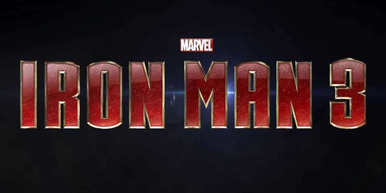
The earlier films in this trilogy had fairly generic titles, in that they had a metallic feel to them but lacked a certain theme. With Iron Man 3, the title gave off that inventor-like gimmick that was attached to these movies.
The coloring was that of Tony’s most popular Iron Man suit, and if you look closely you’ll notice the words have dozens of scratch marks to signify the many battles that Iron Man had gone through.
9 Black Widow (2020)
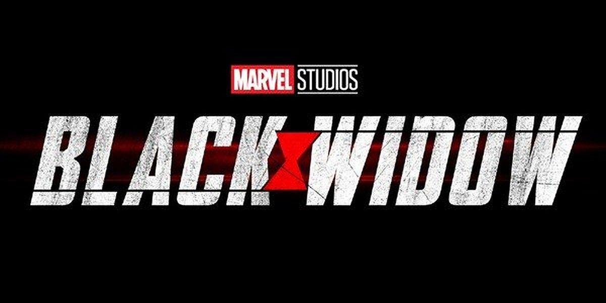
The font alone makes clear the espionage theme that will be the crux of the movie, and the slight tilt in the title is a good touch too as it’s supposed to add a layer of intrigue. Black Widow’s past is shrouded in mystery, which is reflected within this stylization.
There’s a hint of red behind the titles, meant to show how quickly Black Widow could attack without anyone realizing it. It doesn’t have a whole lot of stuff going on, but that’s the point of this card as the spy theme of the movie is conveyed.
8 Spider-Man: Homecoming (2017)
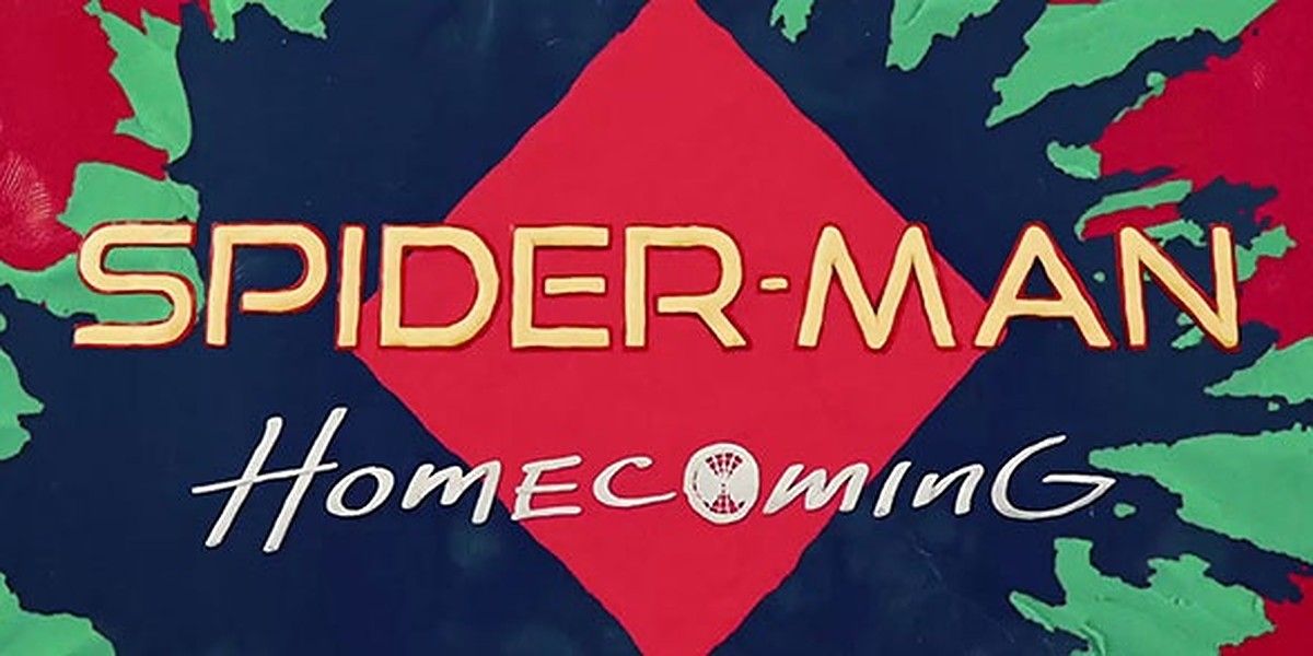
Although it was silly and over-the-top, Spider-Man: Homecoming’s title card captured the spirit of the movie, which was for a fun time to be had. Splashing all kinds of colors to resemble banners in school helped summarize the new Peter Parker.
As we know, the MCU Spider-Man movies aren’t heavy-handed like the previous ones, and this is confirmed just by looking at the title. The best touch has to be the Spider-Man mask featured in the “Homecoming” tag.
7 Black Panther (2018)
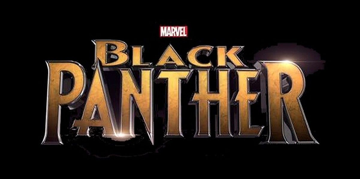
There’s a regal feel that evokes from this title card, and that’s exactly what Black Panther was going for in the movie. Not only do you get reminded of the royal status of the character, but the coloring of the titles are such that you also recall vibranium being a major factor.
We’d have preferred for more colors to be on display, but we also have to give credit for the style of the font being presented as enormous to show off how being the king made Black Panther someone of a higher status.
6 Ant-Man And The Wasp (2018)
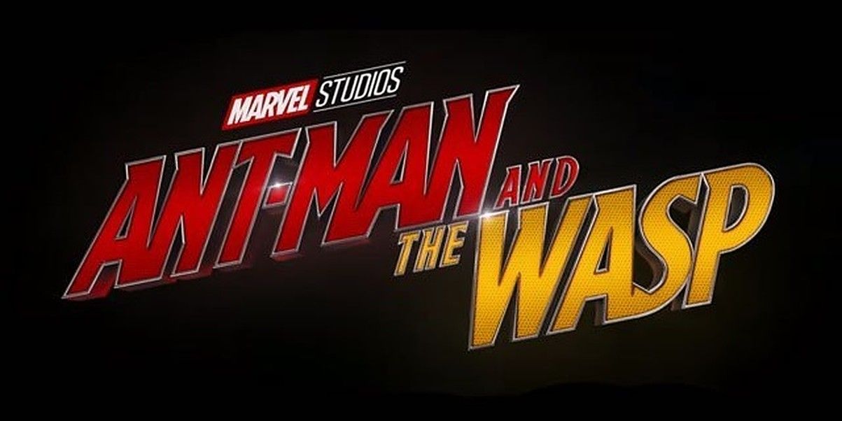
As we brought up with Black Widow, here’s another case of a tilt in style to convey the espionage aspect of a film. You’ll remember how Ant-Man and the Wasp was a fast-paced romp set within a day, and the title is formatted in such a way that you think of high-speed chases.
It’s not as encompassing as the first Ant-Man title card, but the smaller font is understandable given that Wasp has an equal role to play. What we do like is how the “Ant-Man” portion has his colorization, while Wasp has her own in the second half of the title.
5 Captain America: Civil War (2016)
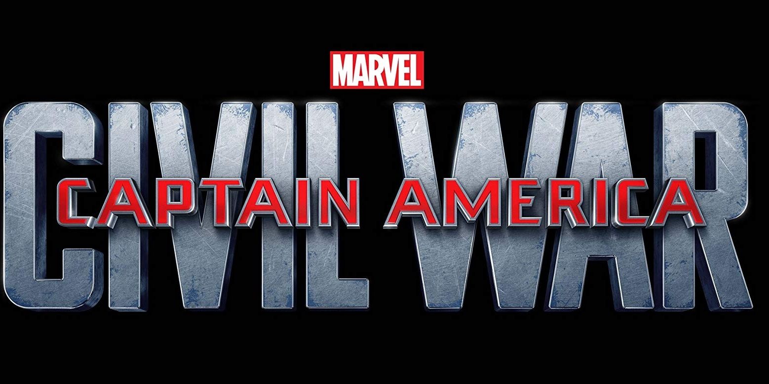
There’s a genius behind this title, in a weird way that many might not even realize that the film’s outline is portrayed here. The reason why the “Captain America” part is smaller compared to “Civil War” is meant to illustrate how our hero was cornered with such a huge conflict.
Even more interestingly, the murky color of “Civil War” is done in such a way that the title character’s name looks like it is behind bars, something the film portrayed. It’s not the most eye-popping card, but it might just be the most nuanced one.
4 Avengers: Endgame (2019)
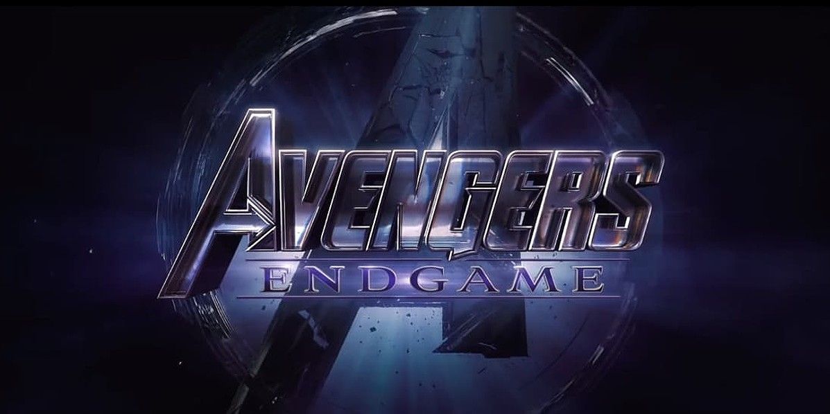
Here, too, the theme of the movie is strikingly clear, with the benefit of a color scheme that not only piques the interest but also points toward the antagonist. Being the film that followed Thanos’ big Snap, Avengers: Endgame’s title captured the morbid setting of the film.
The disintegrating background, of course, points toward this very thing, but there’s a certain beauty about this as well. That would once again be due to the coloration, yet the darker style brings in a comfort level too for some reason, which we’re fond of.
3 Thor: Ragnarok (2017)
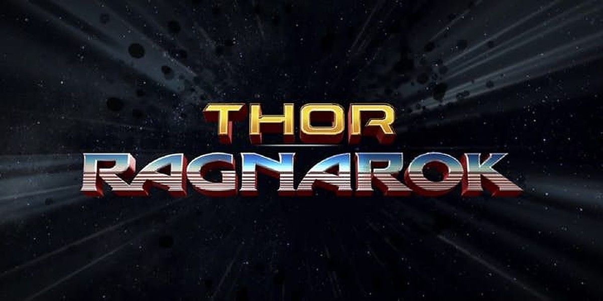
The shift in the series direction from the Shakespearean themes over to one filled with comedy and blockbuster set pieces couldn’t have been better conveyed than through this title card. Here, we can see how the film’s hard-hitting points were punctuated by the presence of boulders in space behind the words.
More so than that, it’s the coloring of the words that were a great contrast to earlier Thor films, which had a one-note style. For Ragnarok, the more expressive title card promised a fun ride through space with dysfunctional characters. This was why it was so easy to accept that Thor would one day join the Guardians of the Galaxy.
2 Avengers: Infinity War (2018)
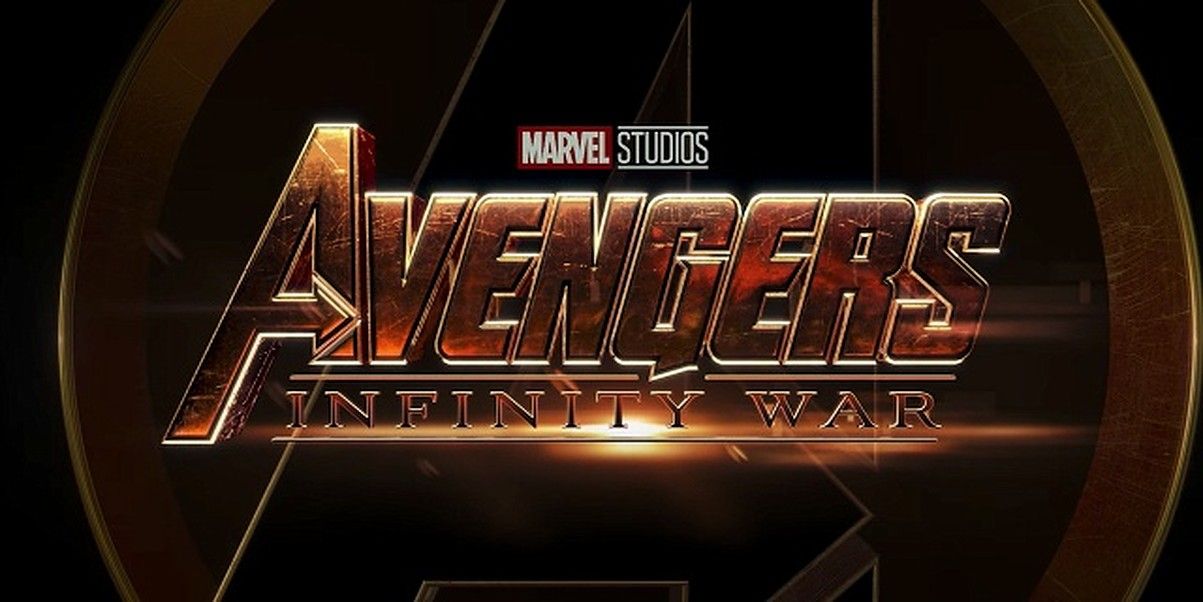
The hype surrounding the release of Avengers: Infinity War was insane, and there had to be a title card that spoke of grand scale things to come. We got just that with this gold-schemed card that has one looking in awe.
The funny thing is how you can almost hear that epic soundtrack blowing out by simply taking a glance at this title card, which is certainly helped by the Avengers logo looming in the back. This card just screams that bigger things were to come.
1 Guardians Of The Galaxy Vol. 2 (2017)
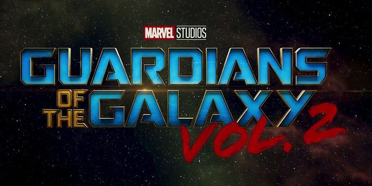
We recently speculated what might be in store for the third film in the series, but there’s no doubt that the thing that will be A-plus is another awesome Guardians of the Galaxy title card. The second installment certainly was a cut above the rest of the MCU films.
With colors splashed across, and the galaxy itself surrounding the words, this card promised whimsical times of hilarity mixed with adventure. Considering that’s what the Guardians are all about, we have to hand it to the developers of this title for perfectly capturing the personality of these heroes, while also hyping up the viewer’s interest.
from ScreenRant - Feed https://ift.tt/332d4v0

0 comments:
Post a Comment