When the original Star Trek first aired in 1966, few could have imagined that a show about a captain trying to seduce green women would have a lasting appeal for generations of fans. Surprisingly enough, it was a hit success, spawning multiple spin-offs that built off of the original lore. Similar to another space odyssey Star Wars, Star Trek has legions of fans that want to know everything about even the most minute details on the show.
With the newest release of Star Trek: Discovery, devoted fans of the show are ecstatic that the props in this series were created by Star Trek fans, giving homage to the original series.
10 Modern And Sleek
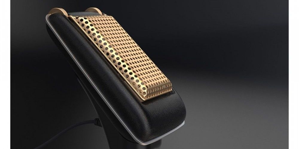
When we look back twenty years ago, the only difference between cellphones and peoples' house phones was that one was in a car. The big, bulky cellphones of Radio Shack's past are no more, as time has evolved them into something that can fit in our pockets. This sleek, modern design of cellphones has a connection to the original Star Trek communicators as it was the first design to contemplate a powerful technology in the palm of our hands. So, when the communicators were built for Star Trek: Discovery, they were meant to resemble the sleekness of modern cellphones.
9 Design Similar To Original Communicators
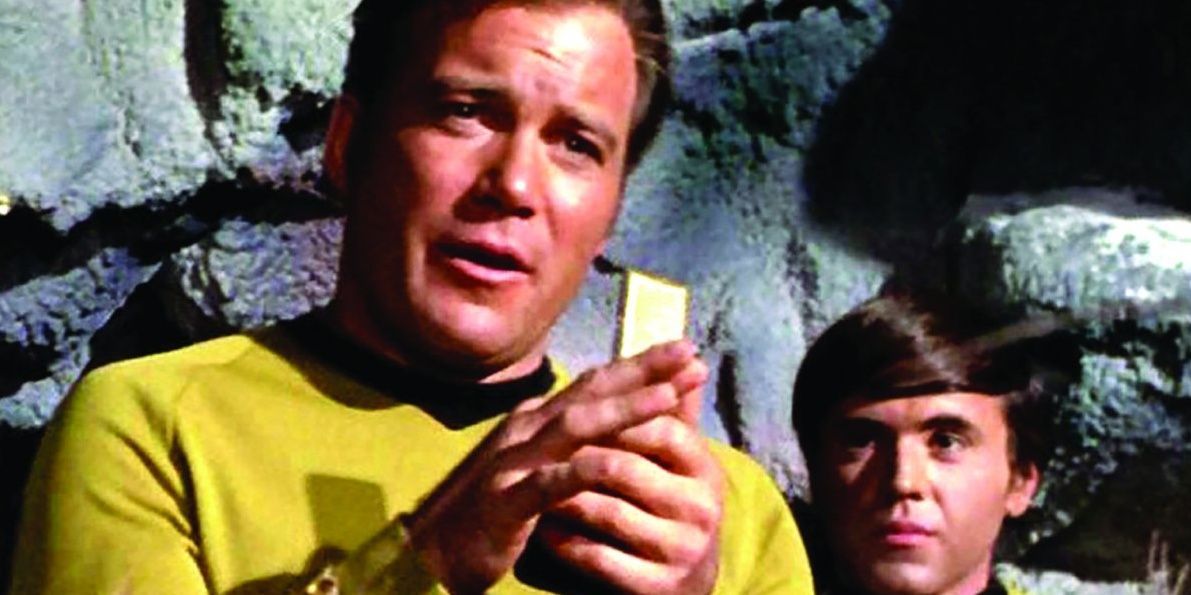
If there is one thing that all fans of any past TV series that has been remodeled for a modern audience know, it is that the fans of the original series will always compare the new to the old. Most time, nostalgia wins every time and newer designs for props that try to make the original better are ridiculed by the hardcore fans. However, the Star Trek: Discovery communicators have been one of the few exceptions to this rule, as fans have been elated that the new communicators were based on the original designs.
8 Detailed Light-Up Readout With Star Fleet Logo
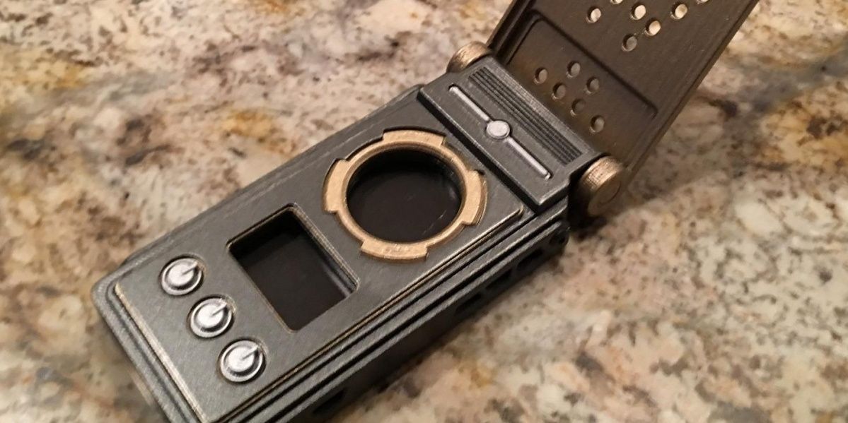
Whether you are selling your published books or are a director marketing campaign for a movie, brand design in the key to success. So, when the new communicators had a detailed light-up readout with the Star Fleet logo draped in the middle, fans couldn't help but enjoy the little Easter egg.
This logo is behind a glass casing and is entirely for show. While it is meant to be a throwback to the original series, it also resembles the branding style that most modern cell phones have on their cover.
7 First Revealed In Teaser Video Clip

One of the first things that most anticipated movies do, especially ones that have a known canon by fans, is to release a few teaser clips before releasing the initial promo. This, of course, serves as a means of keeping fans interested and updated about the upcoming series or movie. Fans tend to gleam enormous amounts of information out of these teasers, especially now in the era of YouTube. With the communicators being the first thing seen in one of these teasers, it could be ruled as a success as it kept the buzz going about the show.
6 Designed By Mario Moreira
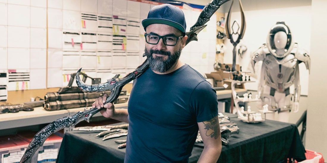
If there is one thing fans hope for, whether it comes to directors or writers for their favorite TV series or movie series, is that these individuals would do it justice. Usually, this is accomplished if the movies or series are written and directed by actual fans of the product they are making. Mario Moreira the Props Master for Star Trek: Discovery just happens to be one of those fans. A Trekkie who respects the history and lore of the original Star Trek series along with all those that have followed.
5 Moreira Wanted To Give It A Retro Look
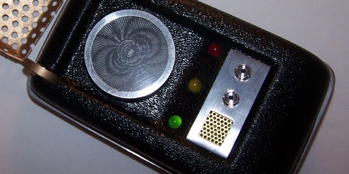
If fans grow up watching a show and a decade later a remake of that show comes into being, these fans will expect it to be a replica of the original. If it's not, then most likely it will be rejected by the masses.
So, when Mario Moreira began designing the new communicators for Star Trek: Discovery, he knew and understood this feeling by fans, partly because he was a Star Trek fan himself. So, instead of creating something completely new, he instead tried to mirror the communicator's original look.
4 Props Master Watched Original Star Trek For Inspiration
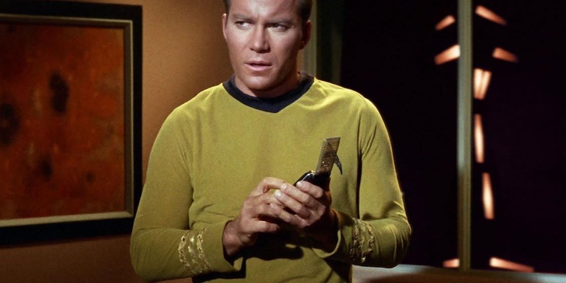
To help gain inspiration for a design that would appeal to fans of the original Star Trek and for those looking for something completely modern, Props Master, Mario Moreira decided to watch every episode of the original Star Trek series to help gain inspiration for a new design. What he concluded after watching these episodes is that the original communicator had some useless design flaws that could be made better. His design replicated the original design but, instead of just going for appearance, he made everything on the communicator applicable.
3 Moreira Tore Apart Phones And Radios For Inspiration
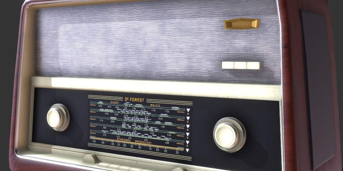
Mario Moreira, the Props Master for Star Trek: Discovery didn't just gain inspiration by re-watching episodes from the original Star Trek. Instead, he used real-life modern advancements as inspiration for his new Star Trek communicator's design. Over an extended amount of time, Moreira tore apart old phones and radios to not just see how they worked but to gain inspiration by some of their sleek, retro designs. In the end, he was able to build upon these designs, to construct Star Trek communicators with a modern and retro blend to give them an altogether fresh feel.
2 Original Form Was Created By 3D Printer
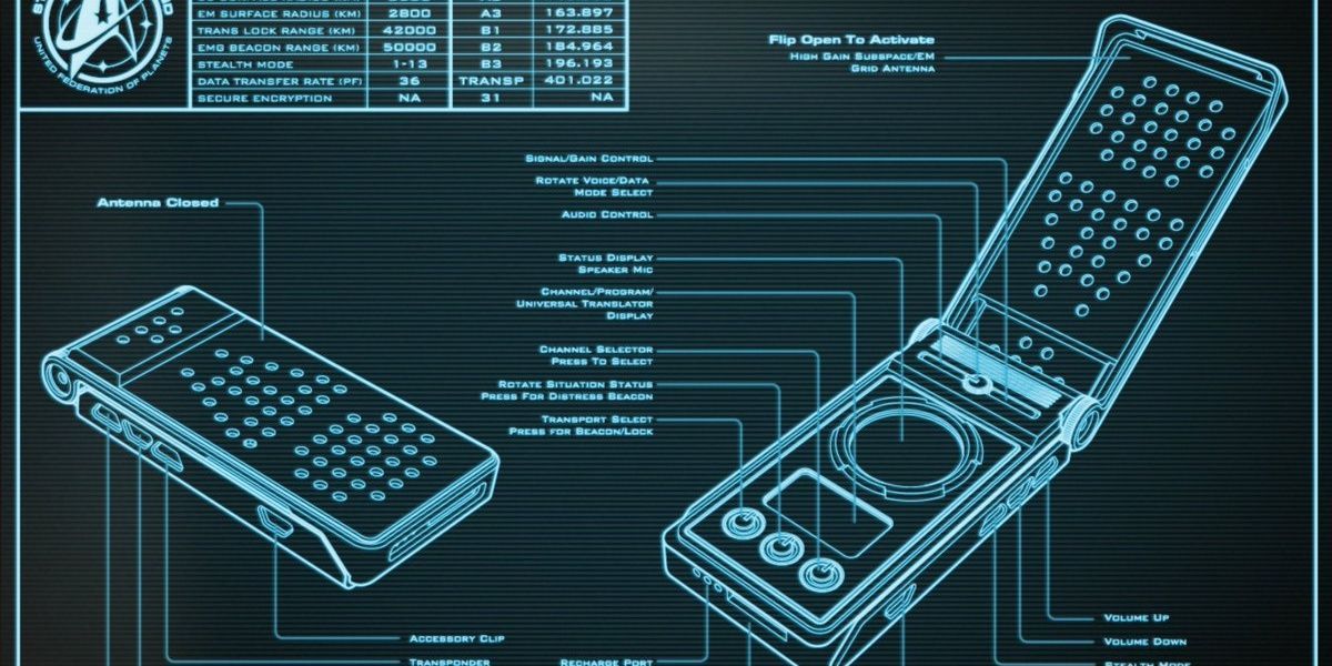
The days of building movie or TV series' props by hand has faded away as more and more props seen on the big screen are actually unique props created by 3D printers. Most of Star Trek: Discovery's props, including the communicators, are made using modeling software that creates a 3D image of an image that has been created on a computer.
The 3D printer scans the image to get the correct dimensions before finally printing out an exact 3D replica that looks and feels like something fans would find in a prop-set junkyard.
1 Communicators Built From Scratch
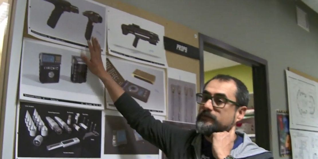
When fans watch TV series like Star Trek: Discovery and the technology that these fictional characters possess, it is hard to fathom that inspiration for this advanced technology comes from real-world technology. The reality is that what the prop creators use to create this fanciful technology for television is to come up with a shape and then shop around for real-world gadgets on the computer, tear these gadgets apart and reuse the parts by painting over them. With spare parts being glued on to create the new and improved prop.
from ScreenRant - Feed https://ift.tt/2UaJgbD

0 comments:
Post a Comment